
OnePay
OnePay is an online banking tool that allows users to track, grow, and manage their finances all in one location. Skip the bank and stop paying the hefty fees. With OnePay you can split bills, pay bills, invest, and send money.

My Roles
UI/UX designer, Research,
User Testing and Analysis

Timeline
5 months

Tools
Figma, Miro, Notion, Optimal Workshop, Vidyard
How can users better manage their money?
Challenge
Users want a virtual banking wallet so they may transfer money, divide bills, invest, and instantly monitor all of their financial data, because it can be tough to manage finances.
Competitive Analysis
To gain a better understanding of what other businesses in the industry are doing well and what they are not, I conducted a competitive analysis. I researched some of the Canadian market's rivals, including Wealthsimple Cash, which enables users to send, spend or receive money instantly. Budgeting and viewing all activities from various accounts are Mint's priority. Finally, Interact, which offers an e-Transfer services and is Canada's most popular funds transmission network.

User Interviews
By conducting user interviews, I try to comprehend what users are attempting to accomplish and what is and isn't working for them. These are some of the questions we aim to answer through user interviews.
How do users stay on top of their finances?
What are the usability issues that user experience?
What are the types of tasks users perform and in what context?
Here is what some users are saying:
"
My bank updated their banking app now I have to do more steps to access my credit card statements, which is annoying.
"
For my investing, I want to see the overview of investments, not just a list of the small transactions I do.
I dislike setting up new payees. It's a long process, and I am reluctant to make my first payment.
"
"
I use Splitwise to divide expenses, but this takes too much of my time.
Personas, Journeys, & Flows
With the learnings and insights from user interviews and affinity mapping, we try to understand their experience. As such, we created user personas to help us further understand our users and develop empathy. We also created user journey maps to uncover moments of frustration, delight, and opportunities to improve their journey through their task.


Original Sitemap

Information Architecture
With the information from the user flows and user tasks, I had to start thinking of Information Architecture (IA) to organize content in a way that is easier for users to navigate. I created a sitemap for OnePay.
Card Sorting
I used Optimal Sort to perform a Card Sorting activity in order to put my presumptions about the original Sitemap to the test. Twenty cards, six categories, and the opportunity to make their own categories were available to participants.
The strongest card pairing was observed in the investing group, as shown in the similarity matrix below. The accounting category saw a significant group pairing between credit card statements and credit card balances. The settings category was split into two: settings and help.

Analysis & Revisions
The send money category was where I mostly encountered debate. It may because Canadian users refer to this feature as an "e-transfer." Therefore, the group name needs to be changed.
Additionally, we will change the description to Pay Bills because payment seems too general. To clearly separate settings from support, we will introduce a new category called support.

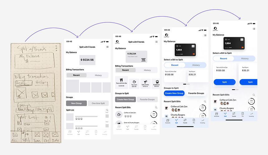
Mid-Fidelity Prototype
Then, I started sketching wireframes and developing OnePay's main features and navigation after collecting information from the Sitemap and User Flow. After many sketches, I created a mid-fidelity prototype.
The focus was on three tasks:
-
Split bill
-
Send e-transfer
-
Pay Bill

Usability Testing
With the mid-fidelity prototype, I conducted user testing early on to validate design decisions.
I conducted 6 usability tests to identify how users navigate through the app and see how efficient users are moving through these tasks:
Task 1
Transfer money
Task 2
Split bill with friends
Task 3
Pay a bill
Prototype Usability Test Sessions


Short clip example of a usability testing session. I used screen recording, video and sound recording for all sessions.
Usability Testing Results

Findings & Improvements to Prototype
Observation
Users struggled to close the pop-up window on the success screen.
Solution
Increase the touch surface area to the standard width and height of 48dp.
100% of participants had issues tapping the closing "x" to close the pop-up window on the success screen.


Observation
Users didn't know if they should close the pop-up window after selecting the account to pay.
Solution
Once a user selects an account the pop-up should hide to reveal the account selection on the main screen.
75% of participants felt hesitant to close the pop-up window after selecting an account.


Observation
The bottom menu was half hidden because the device used by some participants was smaller than the dimensions of the prototype.
Solution
On subsequent iterations, ensure the device used matches the dimensions of the prototype.
50% of participants had issues scrolling down to see the bottom menu.

Design Iterations
Decisions. Reasons. Validations.
Taking in the feedback through the development of OnePay, we can see the design iterations of the app screens.
For example, on the Split screen, we received feedback from users testing stating that users liked the different options on this screen, but the screen was quite busy. As such, we try to answer this question: How can we keep options for users but reduce cognitive load?
We began by reviewing the labels. To give users a clear guide, copywriting is essential. Secondly, define the default state for segmented buttons. Third, prioritize progressive disclosure. If an option is not necessary on this screen, move it to a later screen where it makes sense.
Main Features
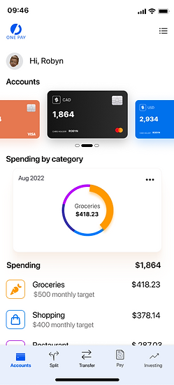
All accounts in one place
Different accounts for different purposes. Swipe left or right to swap them. OnePay will automatically categorize your spending so that you always know where your money is going.
Compare your actual spending with your budget, and take control.

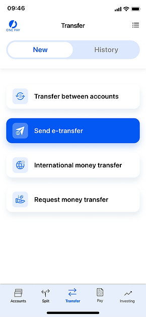
Transfer money, your way
Transfer function, one screen with many powerful options. Transfer between accounts, send money through an e-transfer, international money transfer, or request money.
Select a person from your contacts, how much to send and from which account to send the money. Easy. Secure. Your way.


Split bills, fast and easy
No more data entry to split bills, select a bill from recent transactions. You can choose a bill to divide, select your contacts or a group, separate evenly among your friends or edit the amount.
Never chase your money again. OnePay keeps tabs on recent split bills to see who has paid and what is still due.


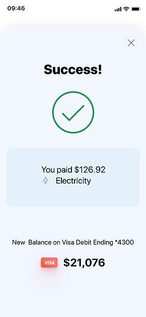
Pay and manage your bills
Paying your bills has never been more convenient. Select a bill and account and you're done.
Manage your bills however you wish, add payees easily, view history and export information at any time.


Design Handoff
With the design finished it was necessary to clearly document a Design Handoff to pass all relevant information and keep every stakeholder in the loop. I set up design guidelines so that future iterations would have a reference.
Complete Design System here.


Accessibility
One of the issues I had is there wasn't enough contrast between the background and secondary text. I followed WCAG to make sure any user could use OnePay successfully. I focused on contrast and text, labels colour and size, target size, clear navigation access, and labels.


WCAG colour contrast checks and updates
Final Design


Reflections
Managing Feedback
Feedback gathering during user testing can be unsettling if you don't know how to prioritize feedback. Using the rainbow spreadsheet helped rank errors based on gravity and frequency.
Prototype. Learn. Implement
Nothing beats obtaining feedback directly from users through a prototype testing session. Some users had no trouble completing tasks, while others needed more time. It was crucial for this project to draw inspiration from other financial apps since consumers were forming conclusions from their previous online banking experiences.
Prototype
A prototype was created to continue to refine OnePay features and design. Would you like to have a look at it?